 |
| illustration by Cindy Garber Iverson |

Showing posts with label creative studio. Show all posts
Showing posts with label creative studio. Show all posts
Yeah, this is how geeky we really are... we sit around thinking up stuff like this

Sometimes it's hard to believe some things are possible

Possessing the technical knowledge (and tools) necessary to build a collage piece hasn't really been my issue. The process of finding just the right vintage illustrations to combine together just always seemed daunting. I just didn't believe I could actually do it. I finally decided last night I should just try it--determining that if I failed, I could fail privately and no one would know the difference.
I really wanted to do something Christmas-y. I found a lovely antique fashion plate of a woman in gown trimmed in red. That was a good start.

Then I had to put in her a setting. I wanted something a bit on the whimsical and fanciful side. I thought it would be neat to have her walking through a snowy forest. I went over the Graphics Fairy blog to hunt around and see if she had anything I could use. She did! What I found was a bonus, because I had also envisioned incorporating a reindeer or moose image too.

As I set to work on the long process of digitally restoring, enhancing, and altering the antique images, a story began to form in my mind. Here's the story that unfolded as the digital collage came to fruition...
On Christmas Eve, the annual festive holiday ball was being held at the estate of one of the wealthiest families in the county. Close to midnight, the belle of the Christmas ball walked out onto the veranda for some air.
Just off the veranda was a pretty-ish sort of wilderness. The newly fallen snow reflected the light of the full moon and glistened back at the twinkling lights of the ballroom.
As the belle stood alone at the edge of the veranda, she thought she heard the soft jingle of sleigh bells coming from within the forest. Her ears must be deceiving her, she thought. The horses and sleighs that had carried all the guests to the ball were housed in the stables far away on the other side of the estate.
The belle was flushed from dancing and the glowing fire in the hearth of the ballroom. She didn't feel the chilly nip in the air on her bare arms as she stepped off the veranda into the edge of the woods to investigate.
Only a few steps into the snow-covered thicket, she was greeted by a timid yet curious reindeer. She should have been frightened, but she was not. Why she wasn't, she didn't know--she just knew she was enveloped by a calm serenity. The reindeer lowered its head and gently nuzzled the belle's outstretched gloved hand.
Just then the belle heard a rustle and the faint jingle of sleigh bells again. From behind a tree not far away, she thought she heard a soft and jolly baritone chuckle.
"Could he really be real?" she asked herself, "Can I really believe?"
 |
| Free ecards or invites |
 |
| Personalized Christmas cards |
Being a stationery designer means I have to think about a holiday long before everyone else does

I've said it before... I love designing stationery. There's only one downside to it. I have to be thinking about a holiday LONG before everyone else. I have to be in a "Christmas-y mood" months before I necessarily feel like it.
I try to release at least one new design for every major holiday every year. This year I've had a design in mind for my 2012 Christmas release for quite some time now. The problem was the more I mulled it around in my head, the more elaborate it got. After I discovered the fantastic paper art of Kevin Kidney, the design in my head got even more elaborate (click here to check out his great blog post on making a Christmas poster). It reached a point where I intended on handcutting every element of the design out of paper, mounting it just right, lighting it just right and then photographing it.
Then visions of trying to do all of this with the "help" of my feline studio companions, combined with their stray hairs and the inevitable creative meltdown that would ensue started to pervade my thoughts.
I was at a creative standstill (it happens to me often). So the design wasn't getting done and the time to release something in time for people to use it for the 2012 holiday season loomed closer.
Yesterday, I finally decided to break down and just do it. I figured I could create a similar look digitally (it wouldn't be near as cool as Kevin Kidney's, but OH WELL!).
I ended up visualizing the pieces the same as if I was going to cut them out of paper, except I created them as digital vector shapes instead. I did all the letters in Illustrator (a major feat for me) and then brought them into PS3 and did the Santa shapes with the rudimentary vector tools in PS3 and was just as happy with the result (if not happier).
Once I had finalized the art. I started incorporating it into various layout versions for different stationery styles.
First, a simple no-message layout for sending as a free ecard at pingg.com (for an added fee you can have it delivered in a cute digital envelope like the one below):


And, finally, I did a layout for a printed photo card for my zazzle shop, Rosehaven Cottage Stationers:

If anyone is interested in a DIY personalized printable file, I will make that available too.
Now my 2012 Christmas design is finally out of my head and available for other people to enjoy. You can't imagine what a huge relief this is for me. Now I can sit back and look forward to Thanksgiving instead of being haunted by visions of paper Santas being pawed at and chewed by naughty kitties... just a tad different from the sublime visions of sugar plums dancing in one's head.
Swallowtails, palms and why procrastination is sometimes a good thing for an artist
 |
| "Swallowtail on lilac" by Cindy Garber Iverson digitally painted photograph Fine art reproductions available here |
Around here it's still too hot outside to start the big garden projects Hubby and I have lined up. Based on the weather forecast, we'll probably have to wait until the first of November to get a cool down significant enough to go out and start moving big rocks, digging post holes with an auger and breaking a sweat. No one wants to do that when it's threatening to be 90F (32C).
And lest anyone think this is due to global climate change... it isn't. This is typical for October.
 |
| "Queen palm" by Cindy Garber Iverson digitally painted photograph Fine art reproductions available here |
Because our days are shorter now, I don't get the lovely twilight hours I get during the summer to putter in the garden. So that means I'm mostly inside in the studio creating and keeping busy.
I've been creating some "for fun" pieces the past couple of days. It's nice when I can just hunt around in my photo archives and pull something that strikes me fancy. Then I bring it into Photoshop and start to play. Sometimes it works. Sometimes it doesn't. Sometimes it's just nice to have my stylus in my hand making "brushstrokes" and digitally painting something. I find it therapeutic. I have lots of time to get lost in my own thoughts and ponder things. It's a form of meditation for me.
And sometimes I'll have something that I got about two-thirds of the way done years ago and then never got back to finishing for one reason or another. Like this...
 |
| Send this as a free ecard here |
The swallowtail butterfly photograph (above top) was a photo I took 5 years ago and didn't really do anything with. Again, because I waited, I know my tools and my own style better now then I did then. I can create something now that I wouldn't have even ventured to create back then. I didn't know how, and I couldn't have envisioned at all.
Then there's the case of a photo like the one of the palm tree (above middle). I took that only a month ago when visiting my brother and sister-in-law. They have gorgeous queen palms lining their backyard. I took the photograph, got it home and wasn't impressed with the backlit result I'd gotten. It wasn't until I had the time to just play with it yesterday that I happened upon the right post-processing techniques for that particular image. If I'd pushed it when I first took the photo (and was busy with other creative work for clients), I probably wouldn't have gotten the result I wanted.
Sometimes procrastination pays off.
Why I love being an artist now more than ever
 |
| The above art is available on acrylic, metal, canvas and paper by clicking here |
This week I've had the awesome opportunity of working with a client on a piece of art for their home. The process I've gone through is a perfect example of why I love being an artist now more than ever.
I did the above mixed media piece a while back and have had it available in fine art reproductions for quite some time. The piece is a digital composition made up of an original watercolor painting, scanned objects (pearl jewelry) and an authentic vintage photo taken in San Francisco that I found in a family photo album.
How did I do it? Here's the cool part (well, it's cool to me) because there's no way I could have done this back when I was in art school before Photoshop existed (yes, there was a time when that was the case).

You may have noticed that the woman's head is slightly more elongated in the original than in the final piece. That's because I decided to scale her head down a bit, so she had a more heart shaped face. I did that when I was marrying everything together in Photoshop to create the final piece.
Then a couple of years later (last week), I get a great email from a potential client asking if I could possibly recreate the piece with different colors to match the client's powder room in their late 1940's San Francisco home. The colors of the powder room? Sky blue with black and white octagonal floor tile. So retro wonderful!
Because the original art piece was done in pieces, I responded that I'd give it a go and see what I could come up with.
Voila!
 |
| The above art is available on acrylic, metal, canvas and paper by clicking here |
There is no way I could have pulled this off without Photoshop. I was able to digitally divide the original painting even more than it had been before. After dividing out the various pieces of clothing so it looked a lot like a paper doll, I used Photoshop's powerful color manipulation tools to change the colors completely. Instead of an olive coat, I created a beautiful blue one. I manipulated the hot pink gloves, shoes, belt and skirt to be various shades of blue (I personally love the pale blue gloves). I changed the tone of the pearls so they weren't pink. I made the woman's lips more red. And I even changed her eye color.
Finally, I was able to give the client two different options to choose from--an all blue composition with a dash of coral (above) and then a multi-colored composition that has blue, coral and wheat (below). I think I prefer the all blue one best, because the woman really pops against that background.
 |
| The above art is available on acrylic, metal, canvas and paper by clicking here |
I'm always surprised at how much I'm able to do now artistically thanks to the technological advances of the past 25 years. Being an artist now is better than being an artist at any other time in the world's history. And I'm sure I'll be saying that in another 25 years from now.
P.S. If you ever see something I've done that you love but want me to recreate it in different colors, email me. I'm always game for a challenge. I don't charge for the recoloring work. I can make it available for you to see what it would look like in a fine art reproduction and then you can decide if you wish to purchase it or not.
One hen has now become a flock (of sorts)
A while back I designed an egg carton label to put on a carton I was returning to a friend that generously gave us some eggs from her backyard hens (click here to see the post where I wrote about it).
Well, last week a very nice lady emailed me to ask if I did bulk quantities of personalized egg carton labels. She wanted to keep the cost low so she could sell the eggs from her own backyard hens for a reasonable price and not have to fold in the cost of an expensive label. Since my online printer only does a more expensive label, I told her that a great option would be for me to design and lay out the labels to print 3 on an 8.5"x11" sheet and make a ready-to-print pdf file available for her to purchase and download (at www.RosehavenCottageDownloads.com). Once she purchased and downloaded the file, she could take it and have the labels printed at her local copying center onto non-scored adhesive-backed label stock and then cut the labels herself. She found out she was able to get the label stock inexpensively by ordering online and only pay for the printing. She loved the idea.
Once she sent me a photo of her hens that are a variety of colors, I wanted to make the labels even more special . My original hen looked a lot like one of her hens, but her other hens looked so beautifully different. So I went about creating two more hens using the photo as inspiration for coloring. That way each sheet of labels will have 3 labels on it, each with a different colored hen.
The photo of my client's hen flock was so good I could see all the nuances of colors in their feathers. I set about trying to capture it while keeping the renderings illustrative and simple at the same time. I think I pulled it off pretty well.
In the end, my client loved the final product and will soon have personalized egg cartons full of eggs. It makes me happy just thinking about it.
 |
| My original hen illustration on the labels looked like this |
Well, last week a very nice lady emailed me to ask if I did bulk quantities of personalized egg carton labels. She wanted to keep the cost low so she could sell the eggs from her own backyard hens for a reasonable price and not have to fold in the cost of an expensive label. Since my online printer only does a more expensive label, I told her that a great option would be for me to design and lay out the labels to print 3 on an 8.5"x11" sheet and make a ready-to-print pdf file available for her to purchase and download (at www.RosehavenCottageDownloads.com). Once she purchased and downloaded the file, she could take it and have the labels printed at her local copying center onto non-scored adhesive-backed label stock and then cut the labels herself. She found out she was able to get the label stock inexpensively by ordering online and only pay for the printing. She loved the idea.
Once she sent me a photo of her hens that are a variety of colors, I wanted to make the labels even more special . My original hen looked a lot like one of her hens, but her other hens looked so beautifully different. So I went about creating two more hens using the photo as inspiration for coloring. That way each sheet of labels will have 3 labels on it, each with a different colored hen.
 |
| Here's the first color variation I did |
The photo of my client's hen flock was so good I could see all the nuances of colors in their feathers. I set about trying to capture it while keeping the renderings illustrative and simple at the same time. I think I pulled it off pretty well.
 |
| The second variation I did was based on a gorgeous hen with iridescent feathers |
I've been working with a bunny...

... not a real bunny but a cute illustration of one I found on an old piece of stationery.
Originally, the bunny looked a bit angry...

Or maybe "deranged" is a better word?
Regardless, the bunny looked a bit too scary for a baby shower invitation. Don't want to send shivers down the spines of the invitees now do we?
Using Photoshop, I doctored the bunny's eyes and got rid of the shadowy furrowed brow. The original print's registration was significantly off, so I fixed up those oopsies to make it nice and clean. Then I paired it with an old Victorian pattern I found in one of my Dover books of copyright free patterns to make the invitation background.
I like the subtle colors and the nostalgic feel to the finished design. And I like that the bunny is more like a "Harvey" bunny and less like a "Monty Python and the Holy Grail" bunny.
Sharing some of my latest creations
Since I spend the majority of my day in my creative studio here at Rosehaven Cottage and not out in the garden, for this post I wanted to share some of the things I've been working on.

I LOVE vintage paper ephemera... cards, magazines, advertising... anything on paper that pre-dates the 1960's. I like to resurrect the pieces I collect and give them a new life for others to enjoy. So if the art is in the public domain (meaning it's old enough that I'm not infringing on any copyrights), I scan the original art on my hi-res art scanner; digitally restore it (remaining as true to the original as I can); and then incorporate it into a new design for this generation to enjoy.
That's what I did with the little firebears I found. The art became two different designs that are now part of my collection at pingg.com available to send as free online cards and invites.

Beginning in early summer, I've also had the pleasure of creating a couple blog designs.
Over the past couple of weeks, I've had the pleasure of redesigning the blog/website for The Lavender Spool (www.thelavenderspool.com)--a creative business owned and operated by my very talented sister, Jill. She needed a website that would serve as a portfolio site for her custom creations that range from couture modest gowns to one-of-a-kind jewelry made from reclaimed pieces to adorable handmade toys. It also needed to be an online "calling card" that could be viewed on any mobile device as well as computers. And it had to fit her impeccable style. I'm really happy with the way it turned out.

During the latter part of May and early June, I worked with Kimberly at Saltwater Chick Designs (www.saltwaterchickdesigns.com) to create her blog/website from scratch. She's launching a cottage-style furniture business and needed an online venue to share her creations. I had already created the chick logo but the chick needed a home. Now she has one that exudes all the beach cottage charm of Kimberly's creations. I also got to design her business cards, her price tags and even a cute custom iPhone cover featuring the chick.

For those interested in my designs services, click here to read more about everything I do or click here for my general design services and fees.

Solving the conundrum of sharing the fruits of my labors

Over the years, I've noticed a phenomenon with my blog. When I post about "life stuff", readers leave comments or send me a private email. But when I post about "work stuff"... well... it's like in the cartoons when you only hear the sound of crickets. I don't know why that is but it has made me reticent to post anything about my professional creative pursuits.
Here's my problem... a huge part of who I am is that creative professional. Being creative and running my design studio takes up most of my day. I spend hours on end in my home studio. So when it comes time to blog, I'm always faced with this conundrum of whether I share anything that I'm doing and risk the "sound of crickets".
Consequently, my blog posts end up representing only a fraction of who I am. Yes, I am a nature lover and steward over a small backyard wildlife habitat. Yes, I am also a survivor of some serious DIY projects.
But I am more.
Here's an example of what has happened to me many times. I'll be in a conversation with someone in person, and they'll mention my blog as something they enjoy reading. Then they'll ask, "So what do you do for work? Anything other than work in the garden?"
*sigh* [my conundrum has once again reared its ugly head]
Or here's another example that's happened more times than I can count. I'll be in a conversation with someone in person and suddenly they'll say, "You're a graphic designer?!?! You design stationery?!?! I had no idea. So-and-so just ordered their wedding invitations. I wish I'd known. You probably could have designed exactly what they wanted instead of what they settled for."
Again... *sigh*

I thought of a potential solution. Add a FAQ (frequently asked questions) page to this blog. So that's what I did. Look up at the top right and you'll see the "FAQ" link. In some of my answers in the FAQ, I include a link to my newly created "Design services and fees" page (or click here to see it). I hope you'll take time to go visit what I've written.
Oh... I guess I should add (just for the record)... I am a designer, illustration artist, and photographer. Rosehaven Cottage Inc. is the name of my design studio where I create beautiful custom stationery, custom web elements, logos and just about anything else graphic design related. That's what I "do for work". And, yes, I design invitations and other stationery. So don't ever settle for something that kind of looks like what you want when I can design something that looks like the invitation of your dreams.
And hopefully after I post this I won't get the "sound of crickets" as a response.
Enter Lady Spring

I was laying in bed last week just beginning to wake up, when I had an image come into my head. It was the image of a Marie-Antoinette-type woman whose big bouffant hair became clouds. The more I thought about her, the more she formed in my mind until I finally had to go into the studio and sketch her out (that doesn't happen very often for me). Since then, I've been working on her when I can. Despite missing the first day of spring, I finally completed her today.
The composition is a symbolic representation of the entrance of spring and reads from left to right with the beginning of spring (March) being on the left progressing through to the end of spring (May and June) on the right. I wanted to represent how spring comes in chilly and ends with beautiful blue skies. I did this in two ways. First, I made her dress a lighter grey on the left-hand side with the dress becoming a deeper blue as the eye moves right. Second, the movement in the background on the left represents the wind and bluster of spring's beginnings and then the calm tranquil background on the right represents what late spring is like.

I adorned Lady Spring with blossoms from the spring garden. The trim on her dress is made up of hundreds of almond blossoms (the first flower of spring). The almond blossom petals are carried on the winds of March which are represented by the fan she carries. Lady Spring also has crocus, periwinkle, jonquils, lilacs, daffodils, roses, and tulips adorning her gown.
Lady Spring is followed by her puffy grey tabby as a nod to the old adage "March comes in like a lamb, and goes out like a lion". Kitty has her own little adornments of spring blossoms around the base of her tail--jonquils and almond blossoms.

I did the entire composition digitally in Photoshop from beginning to end (even the first sketching that I usually do in pencil on paper). I used a lot of new techniques I haven't used before too. Usually when I do that, I'm not very happy with the result because the methods are so new, but this time the art came out just like I was seeing it in my head. That's a sign to me that I'm making creative progress.
The heat of summer has finally arrived

I think it's finally decided to be summer around here. We've had an unseasonably wet and cool May and June. Finally, the heat decided to arrive this week with temps hovering around 85-91F (29-32C).
The only problem is that with the heat comes the western sun shining in my southwest facing studio windows in the late afternoon and evening. Since I don't have air conditioning this becomes a problem. Like every summer, I'm having to find a way to shift my creative clock so I feel inspired at different times of the day other than when the sun is streaming in my window.
It seems counter intuitive really. Artists and photographers love natural light. But when heat comes with that light it changes my priorities.
Thankfully, it cools off after the sun sets when gentle breezes blow in off the water of the San Francisco Bay. Then I can open my studio windows, air out the stuffiness and start creating again.
Two views of a purple Japanese Water Iris

Georgia O'Keefe said:
"Nobody sees a flower, really, it is so small. We haven't time - and to see takes time like to have a friend takes time.Her words could be my own. The small and subtle details of the many flowers that grace this earth have drawn me in since I was a small child. And finding a way to celebrate what I see in a flower through my art and photography has been one of my strongest creative motivations both before and after my discovery of Georgia O'Keefe.
"If I could paint the flower exactly as I see it no one would see what I see because I would paint it small like the flower is small. So I said to myself - I'll paint what I see - what the flower is to me but I'll paint it big and they will be surprised into taking time to look at it - I will make even busy New Yorkers take time to see what I see of flowers."
"I decided that if I could paint that flower in a huge scale, you could not ignore its beauty."
"When you take a flower in your hand and really look at it, it's your world for the moment. I want to give that world to someone else. Most people in the city rush around so, they have no time to look at a flower. I want them to see it whether they want to or not."
The two images I've included in this post are a perfect example of what I mean. Below, is a photograph I took last week of one of the Japanese Water Iris that grows and blooms at the pond's edge in the back garden here at Rosehaven Cottage.

This shot is "SOOC" or straight out of the camera. That means that I haven't done any digital editing to it once I imported it into my computer from my camera. I just added a watermark and that's it.
The image at the beginning of this post is the same photo except I cropped it digitally after I imported it into my computer from my camera. It's the same photo of the same flower but looks at what you see now:
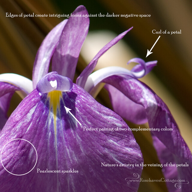
Because the flower doesn't automatically register in your mind as, "Oh, that's just a flower", your eye can pay attention to the details that your mind would gloss over otherwise.
- The pearlescent sparkles on the petal of the iris become evident. It's a beautiful detail on most iris petals that is often missed.
- The edges of the petals become more obvious and the forms they create become more striking especially against the darker background that creates the negative space in the composition of the photo.
- Little details like the curl of a petal become strikingly prominent and make your eye follow their fluid flowing lines. Your eye moves through the composition differently because of it.
- The small patch of yellow in the throat of the iris is now the central focus of the photo. Against the purples of the rest of the petal, it becomes an example of a perfect pairing of complementary colors (colors that sit opposite one another on the basic color wheel). Yellow and purples are complementary colors. The combination of red and green is another one. And the pairing of blue and orange is yet another. Complementary color pairings are very pleasing to the eye. And nature is demonstrating this with this flower.
- Nature's artistry is also seen in the beautiful veining of the petals. The lines create symmetry, flow and interest in the photo.
Introducing... The Merrilee Esther Nature Collection

Last Friday night, Hubby and I went out to dinner with a couple whom I hadn't met yet in person although Hubby had. We sat in a cozy local Italian place chatting and eating delicious authentic Italian food. It was one of those meetings when I felt like I really hadn't met someone new. It helped that because of Hubby we had been Facebook friends prior to the dinner. But there was something else in the ease in which the conversation flowed. It was very nice.
One of my newfound friends is the reason for this new collection I'm featuring. Like me, Merrilee is a nature lover through and through. And she graciously asked if I would like to offer some of her nature photography as free digital downloads at the Rosehaven Cottage Digital Download Shop. Of course I said yes!
Named after her, The Merrilee Esther Nature Collection will hopefully grow over time. The first set Bark and Branches and the second set Water and Waves are now available to download for FREE to use as desktop images, scrapbooking backgrounds, Photoshop textures or anything else creative you can think up. You can pick and choose which ones you want to download out of each set.
To receive announcements when future sets are released, "like" Rosehaven Cottage Inc. on Facebook or follow Rosehaven Cottage Inc. on Twitter.

Oh... and by the way... Merrilee is also the proprietor of Life Is But A Dream - Cupcakes and More. Click below to see some of her delectable desserts.

Blog Giveaway: School-style Valentines featuring "Kitty cat love"

I had so much fun painting my "Kitty cat love" Valentine illustration. I love kitty cats, and I love Valentine's Day so the pairing of the two seemed perfect. My illustration shows Mr. Kitty giving a chocolate mouse (not mousse) truffle to his Valentine Miss Kitty who has a red-bowed fish to give to her beau in return.
To celebrate the completion of this illustration, I had some sweet "school style" Valentines printed so I could host a giveaway here on the blog!
What's fun is that there will be more than one winner! There will be five winners! Each winner will receive a pack of 20 "school style" Valentines (2.5"w x 3.5"h) like the kind I loved exchanging with classmates when I was in elementary school.
Valentine Giveaway Guidelines:
- Everyone who leaves a comment here on this post will be entered. Each person will only be counted once so duplicate comments won't help your odds (sorry)
- Entries will be accepted up to midnight February 1, 2011
- I will pay shipping to the winners of the drawing
- If you don't have an email link connected to the i.d. you use to leave the comment, then you'll have to check back on February 2, 2011 to find out if you won and then contact me via email so I can get your postal address privately.
- If you do have an email link connected to the i.d. you use, then I will contact you off the blog as well as announce you as the winner.
- Basically, it's the standard blog giveaway rules that are out there in the "blog-o-sphere" already.


Behind the Scenes: "Building" a Snowman (a work in progress)
As I often do, I tried to cram one too many designs on my "to do" list for my 2010 holiday designs. I was done and then decided to do "just one more". I was mostly done with it when I lost my head of steam. When this happens with a seasonal piece, I put it aside until the next year rolls around--which is what will happen with this snowman sketch.
Poor little snowman... it isn't his fault.
Then I decided he would be a good behind-the-scenes subject for a blog post. So Mr. Snowman does get to have some fun this year after all!

Above is the rough scan of the pencil sketch of Mr. Snowman. I do all my preliminary sketching by hand in one of my various sketchbooks (one for small sketches, one for large sketches and one for on-the-road sketching).

After I've scanned in the pencil sketch, I bring it into Photoshop CS3 and perform clean-up with the help of my Wacom Cintiq digital tablet. I do this because I want all the specks and flecks that are picked by the scanner up from the white paper to not transfer when I print out the outline sketch onto watercolor paper.
Next I print out the snow man on a piece of 12x17 watercolor paper using my Canon Pro9000 ink jet printer. I choose this size because that's the largest I can scan once the painting is done. Even if the original sketch isn't that large, I enlarge it to fill the paper.
Then I secure the watercolor paper that has the printed outline on it to my painting board, I break out the watercolors, and I begin painting.

Oftentimes, I will scan the painting after completing one stage (in this case the black hat and coal buttons). This is a good practice for me just in case I do something I don't like later in the painting process. If I do, I can always reprint the outline and repaint the elements I didn't like and then digitally marry them with the elements I did like from previous scans.

There is a quality of painting that I can only get with watercolor and haven't been able to replicate digitally. I paint the shapes and elements that I want to have that quality. In this case, I wanted a certain look to the shading as well as a certain brushstroke for each piece of the fringe of his scarf. At that stage, I scanned the painting again and brought it back into Photoshop CS3.
After some clean-up using the Wacom Cintiq again, I decided to apply one of my photo textures to Mr. Snowman to make him look more like he was made of snow (see the texture below).
 Click on texture above to download for free
I also added some additional shading and highlights over the top of the snow to get this...Click on texture above to download for free
Although Mr. Snowman may look like he's done, he really has a way to go. I have to paint the additional elements like the holly berries for his hat and the patterns for the gifts he's carrying. Those will get painted separately and added digitally. Mr. Snowman is also going to need a snazzy background so he isn't floating in white space. And I'll have to design the layouts specifically for each thing he goes on. A 5x7 card layout is much different than an iPhone case and that's different from an e-card/e-vite (the list can go on and on). I may even offer him with different colored scarves and mittens... I don't know. All that work will happen when I begin putting together my 2011 holiday designs.
Mr. Snowman will wait until then. Luckily, he won't melt.
Mr. Snowman will wait until then. Luckily, he won't melt.
Subscribe to:
Posts (Atom)

All images, photos and writing

